

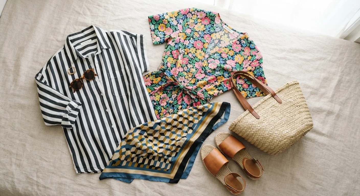
Key Takeaways
Why Pattern Mixing Trips People Up
The instinct to avoid mixing patterns usually comes from a genuine uncertainty about what makes a combination click versus crash. Style media tends to present rule-breaking looks as effortless, which obscures the actual logic underneath—scale, color, and pattern type are doing deliberate work in every combination that succeeds. Understanding those mechanics makes pattern mixing far less intimidating and far more repeatable.
It's also worth noting that most wardrobes already contain pieces that could be mixed—the obstacle is usually confidence, not inventory. If you're working with what you already own, our article on getting more outfits from fewer clothes covers the layering and mixing principles that expand your options without buying anything new.
What you will need
Full-length mirror
Lets you evaluate the full visual effect of a pattern combination before finalizing the outfit.
Solid anchor piece (top, bottom, or layer)
Provides a visual break between two patterns and grounds the overall look.
Color reference swatch or color wheel
Helps confirm whether two prints share a color family before combining them.
The Step-by-Step Logic for Mixing Patterns
The steps below apply to everyday outfits—casual, smart-casual, and most workplace contexts. They're built on principles that hold across body types, skin tones, and garment categories. Work through them in order the first few times; eventually the evaluation becomes second nature.
Identify the scale of each pattern
Lay both garments flat or hold them side by side. Evaluate the physical size of each pattern's repeat—how large is one motif or stripe cycle? Label each as small, medium, or large scale. The goal is contrast: a large-scale floral paired with a small-scale stripe works precisely because the eye can distinguish them as separate elements rather than competing noise.
Find the shared color between the two prints
Lay the pieces together and look for at least one color that appears in both. It doesn't need to be the dominant color—it can be a background tone or a secondary accent. This shared color is what creates visual coherence. For a deeper look at how color relationships work in outfits, see our color coordination reference.
Vary the pattern type, not just the size
Mixing two different pattern families—geometric with organic, stripe with floral, plaid with abstract—tends to work better than doubling up on the same type. Two florals of different scales can work, but the combination will always feel more dynamic when the pattern structures themselves differ. Think of it as giving each piece its own distinct visual job.
Introduce a solid anchor piece
A solid-colored garment—a blazer, a belt, a scarf, or even visible socks—gives the eye a place to rest between the two patterns. This is especially useful when your two prints are both visually busy or when you're still building confidence with mixing. The solid doesn't have to be neutral; it just needs to pull from the shared color you identified in Step 2.
Do the mirror test and make a final call
Put the full outfit on and step back from a mirror. Ask: do the patterns feel distinct and deliberate, or do they fight for attention? If something feels off, the most common fixes are swapping one piece for a solid, changing the layering order, or adjusting proportion—wearing the busier print on the bottom with a calmer one on top, for instance. Trust a quick gut check here more than any rule. See how this principle connects to broader outfit decisions in our guide on fit, fabric, and color.
[tip_callout]Pattern Mixing Has Limits—Know Them
Not every pattern combination can be rescued with clever styling. Two large-scale, high-contrast prints in clashing color families will compete visually no matter how you layer them. Recognizing a genuinely difficult combination early saves you from a frustrating morning. When in doubt, swap one piece for a solid in a shared color before committing to the outfit.
Avoid Matching Scale Too Closely
When two patterns are nearly identical in scale, they tend to vibrate against each other visually rather than harmonize. This is especially pronounced with busy prints like houndstooth or windowpane when worn at the same size. Even a modest size difference between patterns dramatically reduces visual noise.
When to Let a Combination Go
Some pattern pairings genuinely don't work, and that's useful information rather than a failure. If you've tried adjusting scale, confirmed a shared color, added a solid anchor, and the combination still looks chaotic in the mirror, the pieces may simply be incompatible—and that's fine. Forcing a mix that isn't working is one of the wardrobe decisions people frequently regret. Wearing either piece as a standalone, paired with a solid, is always a reliable fallback. Pattern mixing should add to your outfit options, not create a problem you have to solve every morning.
If you're building your pattern-mixing instincts from scratch, it also helps to have a clear sense of how color contrast and tone work together—our complete color coordination reference is a practical companion to the steps above.