

Key Takeaways
Why Color Coordination Actually Matters
Color is the first thing anyone notices about an outfit — before fit, before fabric, before accessories. Yet it's also the element most people approach by instinct alone, grabbing whatever looks appealing in the moment and hoping for the best. That approach works occasionally, but it also produces the closet full of clothes that somehow never come together into actual outfits.
Understanding a few grounding principles changes that. You don't need a design degree or a personal stylist — you need a reliable mental framework. As the broader guide on fit, fabric, and color explains, color is one of just three variables responsible for most outfit successes and failures. Getting it right consistently is less about talent and more about knowing what to look for.
90 sec
Time to form a first impression
Research published in social psychology literature suggests most people form visual impressions within 90 seconds, with color playing a major role.
~62–90%
Proportion of first impression driven by color
Color research in consumer and behavioral psychology frequently cites color as accounting for the majority of snap visual judgments.
Warm Tones, Cool Tones, and Neutrals Explained
Every color has an undertone — a subtle warmth or coolness baked into its base. Reds that lean orange-red are warm; reds that lean blue-red are cool. This applies across the entire spectrum: mustard is a warm yellow, lemon is a cool yellow. Navy reads cool; camel reads warm.
Why does this matter in practice? Colors with matching undertones tend to harmonize naturally. Mixing a warm olive jacket with cool-toned slate trousers can feel slightly off without your being able to name why. Once you recognize undertones, you can diagnose that friction and fix it.
Neutrals — white, black, gray, navy, beige, and camel — are the backbone of most coordinated wardrobes. They're not exciting on their own, but they do the heavy lifting of making other colors accessible. Most everyday Americans rely on neutrals for the majority of their wardrobe and use accent colors selectively, which is a genuinely sound strategy. The wardrobe essentials reference covers why neutral staples earn their place so reliably.
When in doubt about whether a warm or cool neutral to choose, look at the undertone of your most-worn clothing piece and match from there — it's the fastest way to make new purchases feel like they already belong.
Undertone consistency is the quiet engine behind wardrobes that look curated; it eliminates the subtle friction that makes otherwise nice pieces feel awkward together.
Keep a photo on your phone of your core wardrobe pieces so you can reference actual colors while shopping — memory for color is surprisingly unreliable, especially under store lighting.
Store lighting often skews warm or cool relative to daylight, making colors appear different in the fitting room than they do at home, leading to mismatched purchases.
Understanding Contrast and How to Use It
Contrast describes how different two colors are in lightness or darkness. A white shirt with black trousers is high contrast. A cream shirt with tan chinos is low contrast. Neither is objectively better — they just create different effects.
High contrast reads as sharp, bold, and intentional. It tends to feel more formal or polished. Low contrast reads as relaxed, tonal, and easy — the kind of look that seems effortless because all the pieces blend smoothly. Monochromatic outfits (one color in varying shades) are the most extreme form of low contrast, and they can look genuinely sophisticated when the shades are well-matched.
A practical rule: if you're unsure whether a combination works, hold the pieces next to each other and squint. If the tones clash awkwardly in value (one much brighter or darker than expected), that's the friction. Adjusting one piece — swapping to a mid-tone that bridges the gap — often resolves it immediately.
Use the Squint Test Before Committing
When trying on a combination you're unsure about, step back and squint at yourself in the mirror. This blurs detail and lets you see whether the overall color balance reads as harmonious or jarring. If something feels off when blurred, the contrast or undertone balance is usually the culprit — not the individual pieces.
Color Blocking: Bold Without Being Chaotic
Color blocking — pairing solid, distinct color sections in a single outfit — sounds intimidating but follows a simple logic: fewer colors, more deliberate placement. The classic version pairs two complementary colors (colors across from each other on a color wheel, like blue and orange, or purple and yellow) in roughly equal portions.
You don't have to go textbook-complementary to make it work. Analogous color blocking (colors that sit next to each other on the wheel, like green and teal) is gentler and easier to pull off for everyday wear. The key is keeping the look to two or three intentional hues — adding a fourth usually tips into confusion rather than creativity.
Mixing patterns and prints follows related logic: scale and proportion matter as much as the colors themselves. When you're color blocking, give each color enough real estate to read as intentional rather than accidental.
“Color does not add a pleasant quality to design — it reinforces it. The choice of color in fashion functions the same way: it either underscores your intention or undermines it.”
— Pierre Bonnard, Post-Impressionist painter and influential colorist
Building a Coordinated Wardrobe on Any Budget
The most practical color coordination advice doesn't happen in the fitting room — it happens before you shop. Defining a personal palette of three to four core colors (usually two neutrals plus one or two accent colors) means almost everything you buy will work with what you already own.
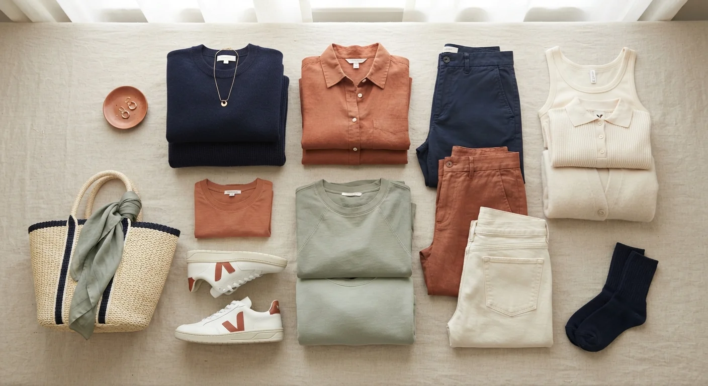
This is the principle behind getting more outfits from fewer clothes: coordination multiplies your options without multiplying your spending. A wardrobe built on navy, white, camel, and rust can generate dozens of combinations from a modest number of pieces, because every item speaks to every other item.
If you're starting with little to work from, the functional wardrobe guide walks through the sequencing — which pieces to prioritize and in what order. Buying within a defined palette from the start prevents the chaotic accumulation of pieces that don't connect.
Define Your Palette Before You Shop
The single most budget-protective move in building a wardrobe is deciding on your core colors before spending anything. Without a defined palette, each purchase is a gamble — it may or may not connect with what you own. With one, almost every piece you buy compounds the value of the rest. Write it down, keep it simple, and treat it as a filter rather than a rule.
Common Color Mistakes and How to Sidestep Them
Even with solid fundamentals, a few recurring patterns trip people up. The most common: buying colors you love in isolation rather than colors that work within your existing wardrobe. A striking coral blazer is appealing on its own — but if nothing you own coordinates with it, it becomes a statement piece you never reach for.
A second pitfall is ignoring the role that fabric sheen plays in how color reads. A matte burgundy and a satin burgundy can look like completely different colors in the same light. When combining similar hues, pay attention to finish as much as color value.
Finally, don't underestimate the difference between clothing color and your own coloring. Certain hues work more harmoniously near the face depending on your skin tone and undertone. This isn't about rigid rules — it's about noticing what makes you look energized versus washed out, and building from that observation.
Avoid Buying Colors in Isolation
It's easy to fall for a color in-store that has nothing to coordinate with at home. Before purchasing a statement-colored piece, ask yourself: does this work with at least three things I already own? If the answer is no, it's likely to become closet clutter no matter how much you love it on the hanger.
Color coordination is ultimately a skill built through attention, not a talent reserved for the naturally stylish. The framework above gives you the vocabulary to start making more deliberate choices — and that's where confident dressing actually begins.